
YouSpark Digital
Case study · Social impact & product strategy

SilverHive

A trust-first friendship platform for people aged 60+ — and the research that showed us when not to build it.

ResultResearch stopped a costly build before funding
UX research Product design Accessibility Product strategy
Product
SilverHive, Leeds
Role
Product designer (UX/UI)
Timescale
6 weeks
Year
2025–2026
Team
Me, 2 developers, backend engineer, product manager, stakeholders
Platforms
iOS, Android & desktop web
Tools
Figma, Figma Make, Miro, Zoom, paper sketches
Older man at a laptop using the SilverHive desktop platform: a map of friends near him in Leeds and a list of chats
01 — Overview

Safe, local friendships for people aged 60+

SilverHive explored whether a trust-first digital platform could help older adults in the UK build meaningful local friendships. Existing social apps often feel overwhelming, unsafe or unsuitable for older people — especially those worried about scams, complex interfaces or making mistakes.

I designed the mobile app and desktop platform around verified identities, local discovery and calm, step-based journeys. Then the research asked a harder question: should it be built at all?

02 — The problem

Loneliness is a silent epidemic for older adults in the UK.

1 in 5adults aged 65+ feel lonely
~2madults aged 75+ live alone
940kolder people say they are often lonely (Age UK)
HealthLinked to depression, anxiety, heart disease and stroke
Why it’s hard to solve Loss of partners and friends Retirement and smaller social circles Mobility and health limits Technology designed for younger users
03 — Opportunity & hypothesis

Is a digital friendship platform the right solution right now?

Governments, the NHS and charities want scalable answers to loneliness, and digital platforms look attractive to funders. But adoption depends on habits, values and trust — not usability alone.

Five smiling older friends gathered outdoors around a phone

The hypothesis

If it was designed with trust, clarity and accessibility, older adults would engage. Specifically:

  • Verified identities would reduce fear
  • Local-first discovery would feel safer
  • Calm, step-based design would build confidence

The goal was to test this through design, not assumptions.

Verified users onlyPassport or National Insurance number checks
Local discoveryA map of people nearby, within a distance you choose
Chats and SilverCircles1:1 conversations and interest-based groups
MeetupsVirtual and local events
Elder-friendly UILarge text and clear actions
04 — Designing with confidence

Reducing anxiety came before features

Paper sketches first, then a Figma prototype for mobile. The experience was intentionally calm and slow-paced.
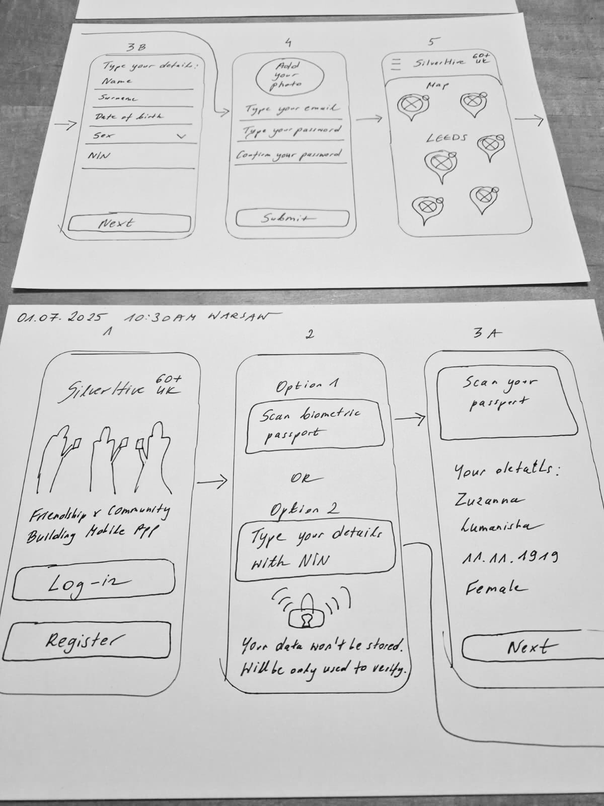
Hand-drawn sketches of the SilverHive app: welcome, verification options, passport scan, personal details, sign-up and a map of friends in Leeds
Paper sketchesFrom welcome screen to verification and the map
SilverHive mobile prototype in Figma: loading, log-in, verification options, map of friends near Leeds, profiles, menu, about and chat screens
Mobile prototypeWelcome, verification, map, profiles and chat — “Because you are never too old for new friends!”

Design principles

  • Large, readable text and strong contrast
  • Plain language and predictable interactions
  • One primary action per screen
  • Clear confirmations and guidance at every step
  • “Your data won’t be stored” reassurance during verification
05 — Mobile first, then desktop

Platform choices driven by real constraints

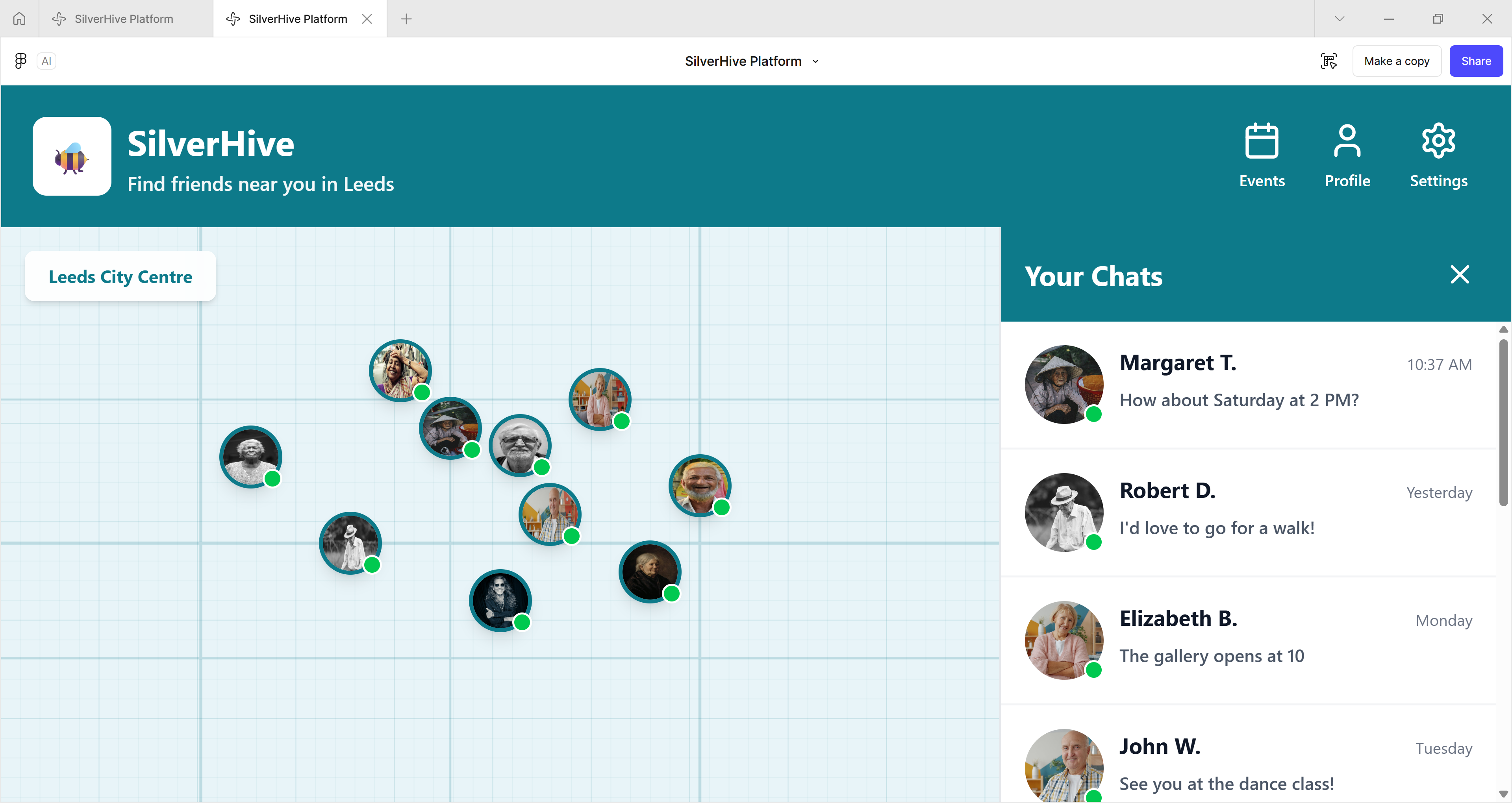
Mobile could reliably scan a passport and verify identity; desktop browsers can’t consistently support document scanning. So desktop used facial detection only, with guidance to finish verification on mobile — and focused on browsing, messaging and reading comfort.
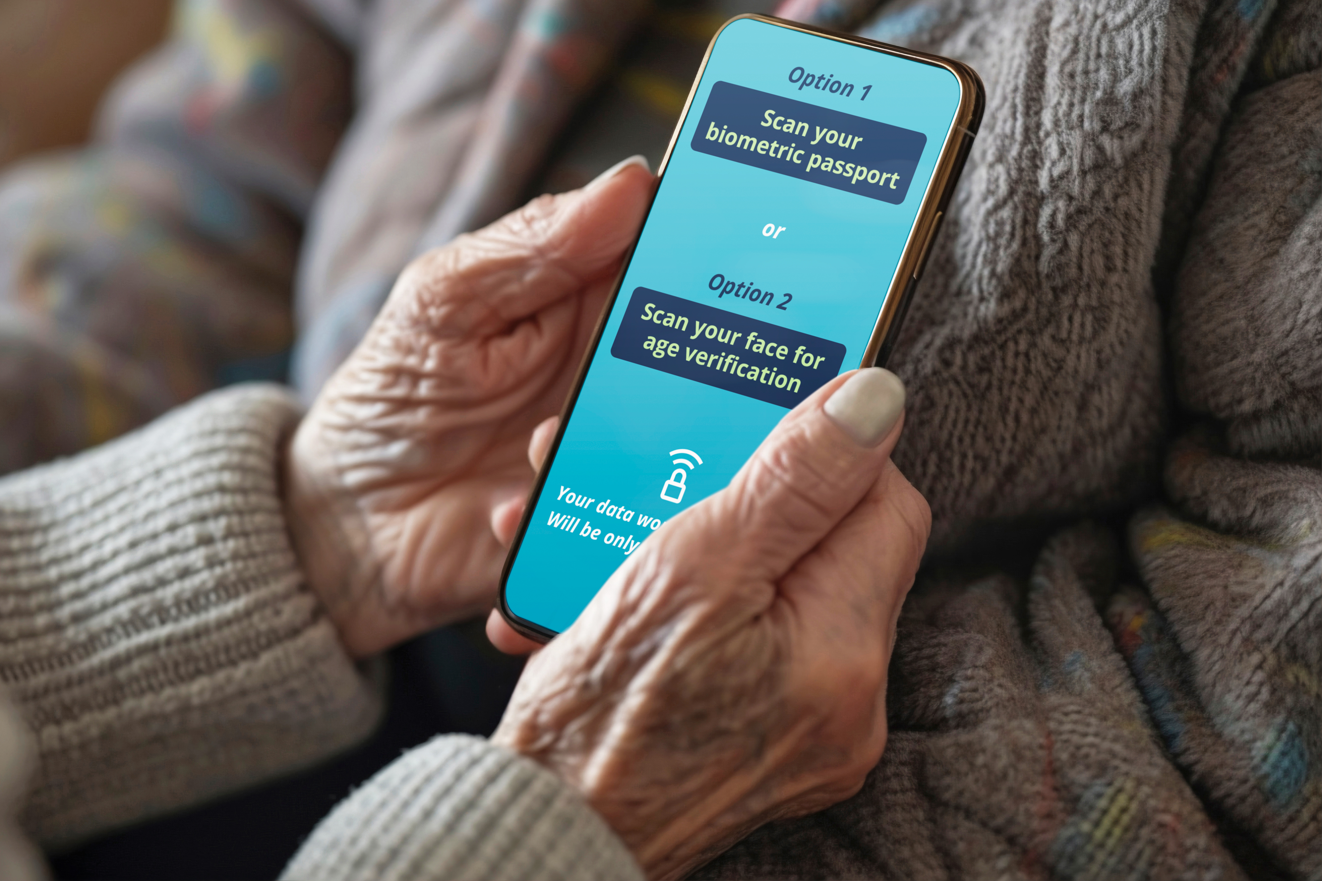
Older person holding a phone showing two verification options: scan your biometric passport, or scan your face for age verification
Identity verification on mobileScan a biometric passport, or your face for age verification
SilverHive desktop platform: a map of friends near Leeds City Centre with a Your Chats panel showing recent messages
Desktop platformFind friends near you, with chats always to hand
06 — Accessibility & WCAG

Inclusive design was non-negotiable

Core journeys were broken into three clear steps — create account, verify identity, find friends — with progress visible at all times.
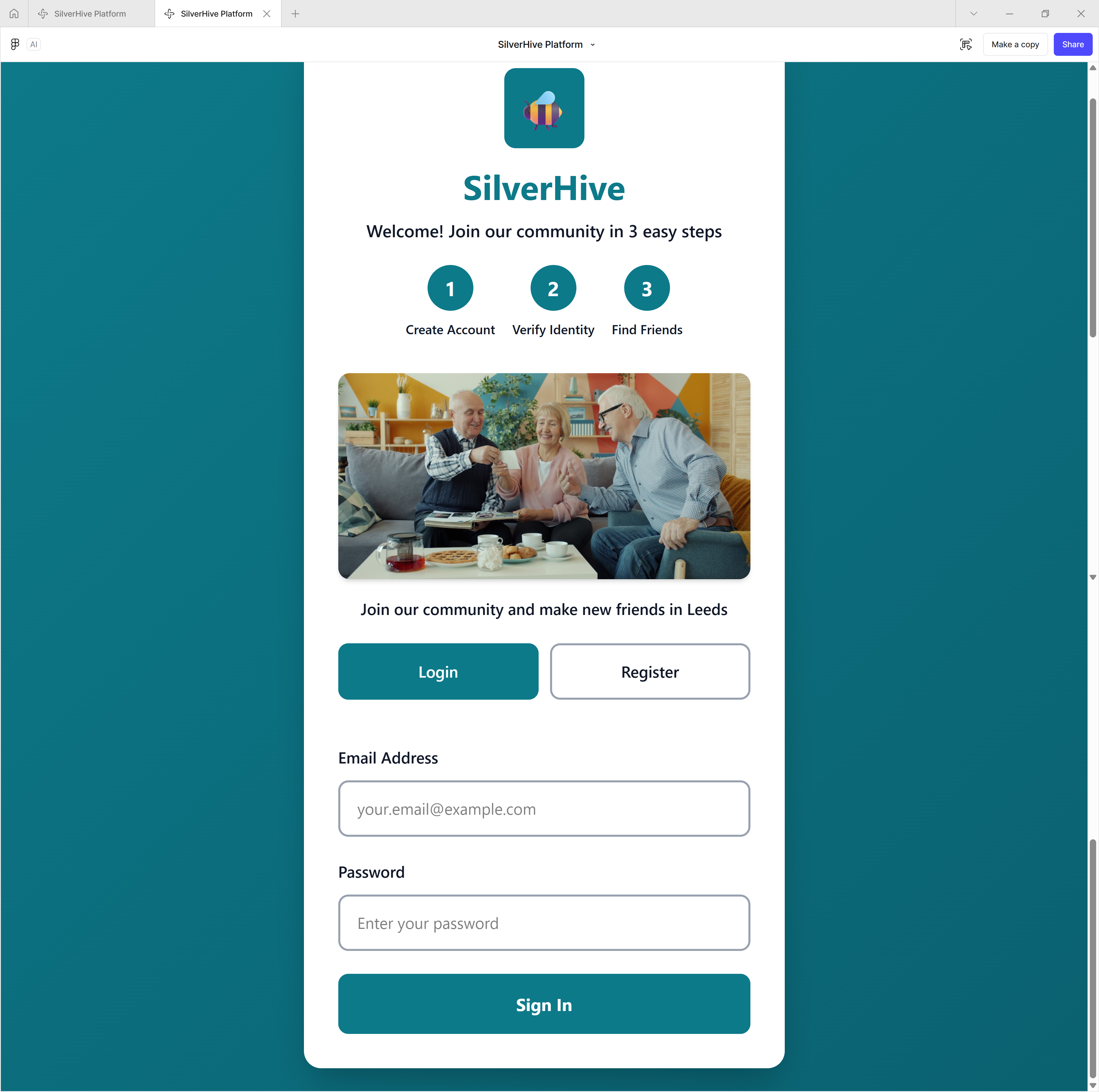
SilverHive desktop sign-up screen: Welcome! Join our community in 3 easy steps — create account, verify identity, find friends
Join in 3 easy stepsProgress always visible, one clear action at a time
  • WCAG contrast testing informed colour changes
  • Font sizes and spacing increased
  • Larger tap and click areas to reduce misclicks
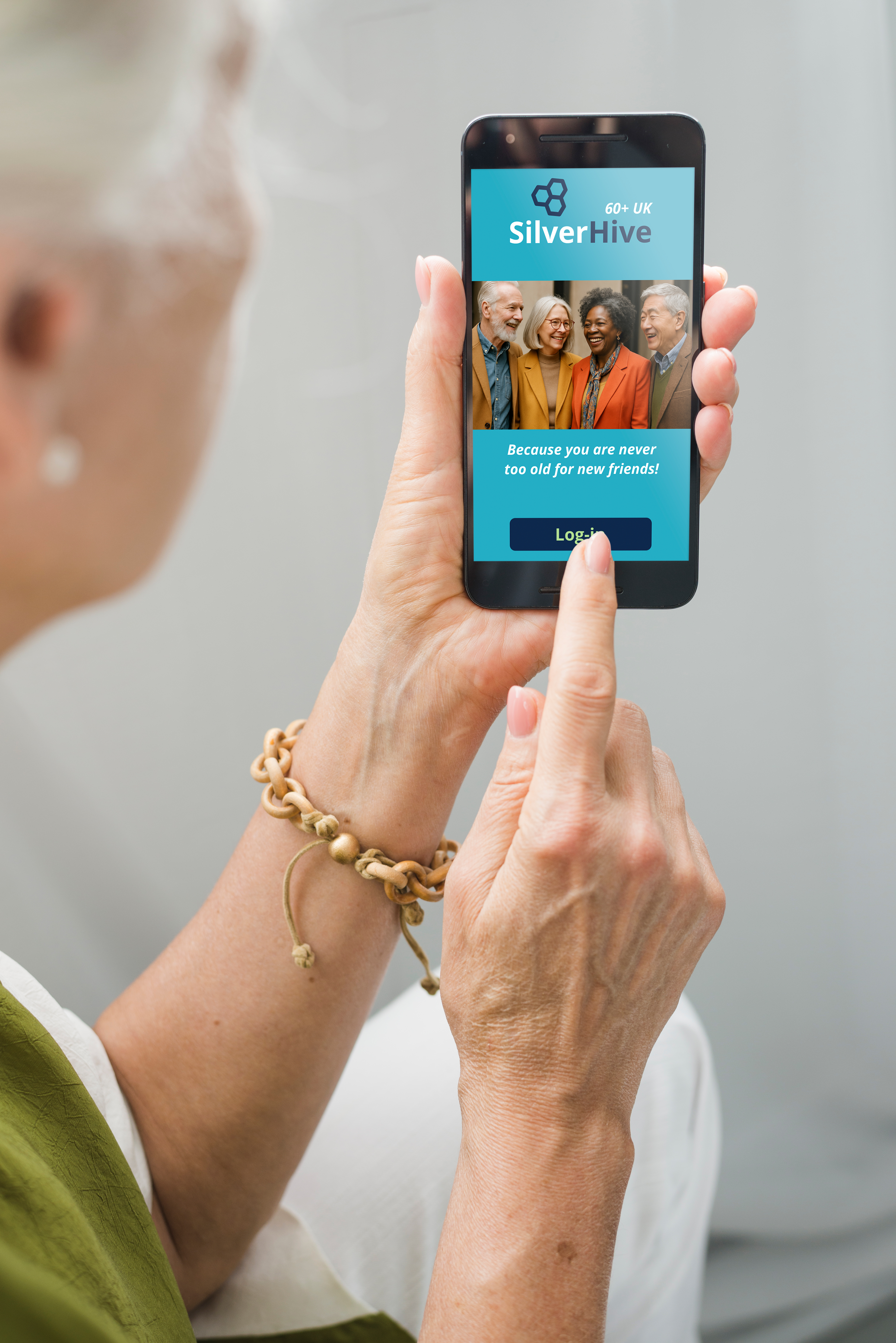
Older woman tapping Log-in on the SilverHive welcome screen on her phone
The welcome screenBig buttons and a warm, simple first impression
Built with costs in mindMobile and desktop platforms, real-time messaging, image and video handling, and AWS hosting and scaling — every design decision weighed long-term sustainability.
Funding looked promisingStrong alignment with NHS and public health goals, and eligible for UKRI, Innovate UK and National Lottery funding. But funding alone doesn’t justify building a product.
07 — User & expert interviews

Validation came late — and changed the direction

Older adults in conversation with a researcher in a community waiting area
InterviewsWith older adults and experts

Who I spoke to

  • A Professor of Clinical Psychology
  • A national grants specialist
  • A local UK vicar
  • UK-based adults aged 60–82

What they said about the app

Easy to readCalm and clearSimple to navigate
The critical insight
“I wouldn’t use an app to find friends — that’s not how I do it. Maybe I’m old-fashioned.”
Usability didn’t equal desire. The barrier wasn’t interface design — it was behavioural and cultural.
08 — Outcome Paused We chose not to pursue further funding or development — on purpose.
A usable, calm productTesters found it easy to read and simple to navigate, with less hesitation during onboarding
No strong demand — yetReal users respected the idea but didn’t want an app to find friends
A generational shift neededAdoption would depend on social habits changing, not on better screens
Risk avoidedFunding applications and engineering work were paused before building a product people wouldn’t use
09 — What I learned

Knowing when not to build is a design skill

  • Not every well-designed solution is right for today’s users
  • Timing matters as much as usability
  • Responsible product design includes knowing when to stop

The concept may become viable in 5–10 years, as digitally native generations age.

Next project Stop Hate UK

Let's build something meaningful together.

Emailzu@youspark.digital WhatsAppMessage me LinkedInzuzannalumanisha
© 2026 YouSpark Digital · Leeds, United Kingdom · Privacy