YouSpark Digital All work
Case study · E-commerce & brand

FALKN

Redesigning the online shop for a premium British roof rack brand — and evolving its identity to match.

UX/UI design Wireframing E-commerce website Mobile website Visual identity Brand guidelines
Client
FALKN, York
Role
Lead UX/UI & visual designer
Timescale
9 months
Team
Me, 3 developers, Head of Marketing, 3 stakeholders
Tools
Figma, Illustrator, Photoshop, InDesign
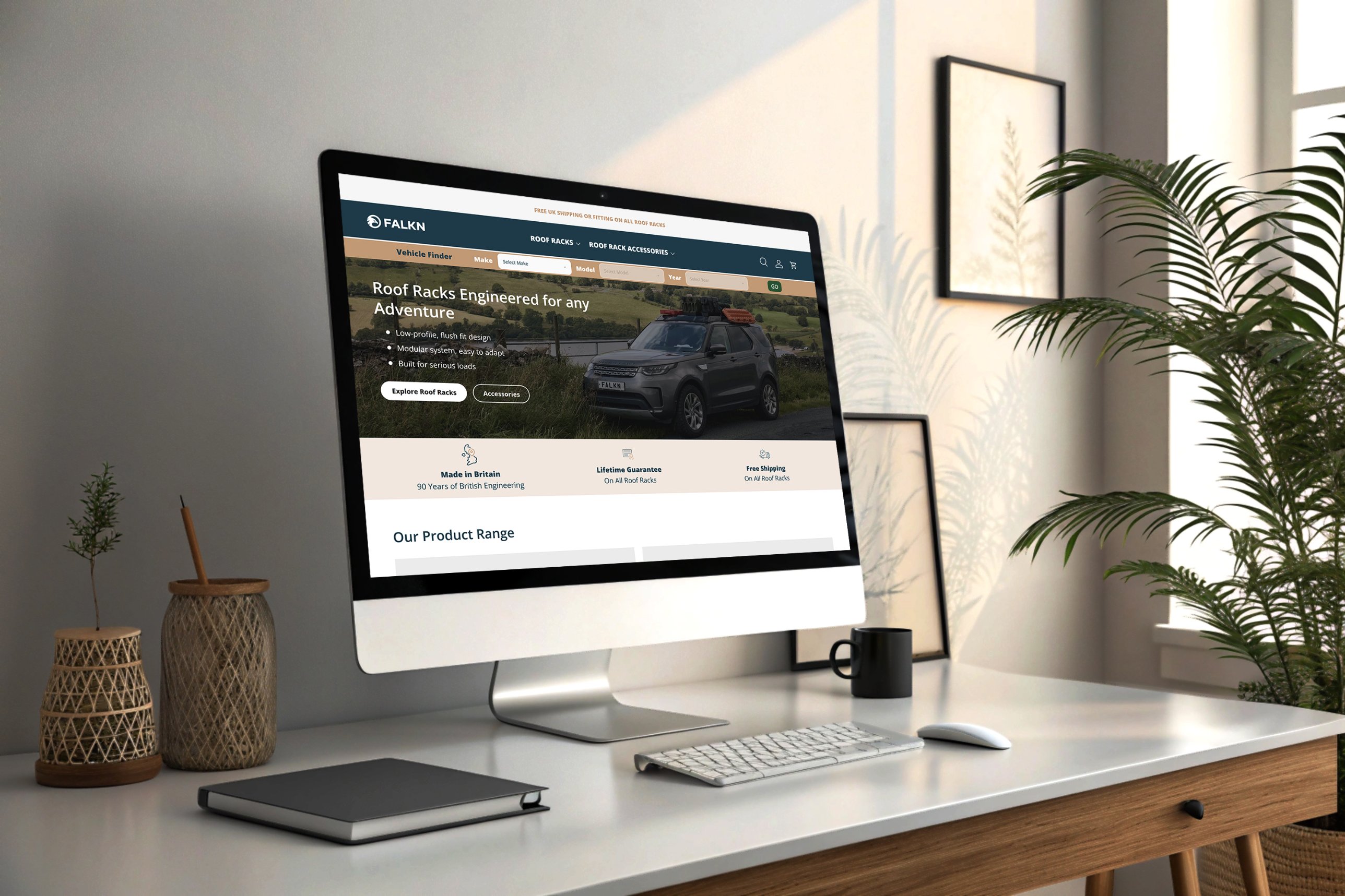
FALKN roof rack e-commerce website shown on a desktop monitor
01 — Overview

Make complex products easy to buy

FALKN sells premium roof racks and outdoor kit. Its products are technical, and customers have to be sure a rack fits their vehicle before they buy.

I led the UX/UI and visual design end to end — discovery, wireframes, prototypes, interface design, the design system and the brand guidelines.

02 — The challenge

Help customers find the right rack for their car — fast — while the brand feels both engineered and approachable.

01Technical product information was hard to navigate
02No quick way to find products that fit your vehicle
03No consistent visual system across desktop and mobile
04A premium brand that still had to welcome first-time buyers
03 — UX audit

Where the old site fell short

I mapped the previous Prospeed website page by page and annotated every friction point.
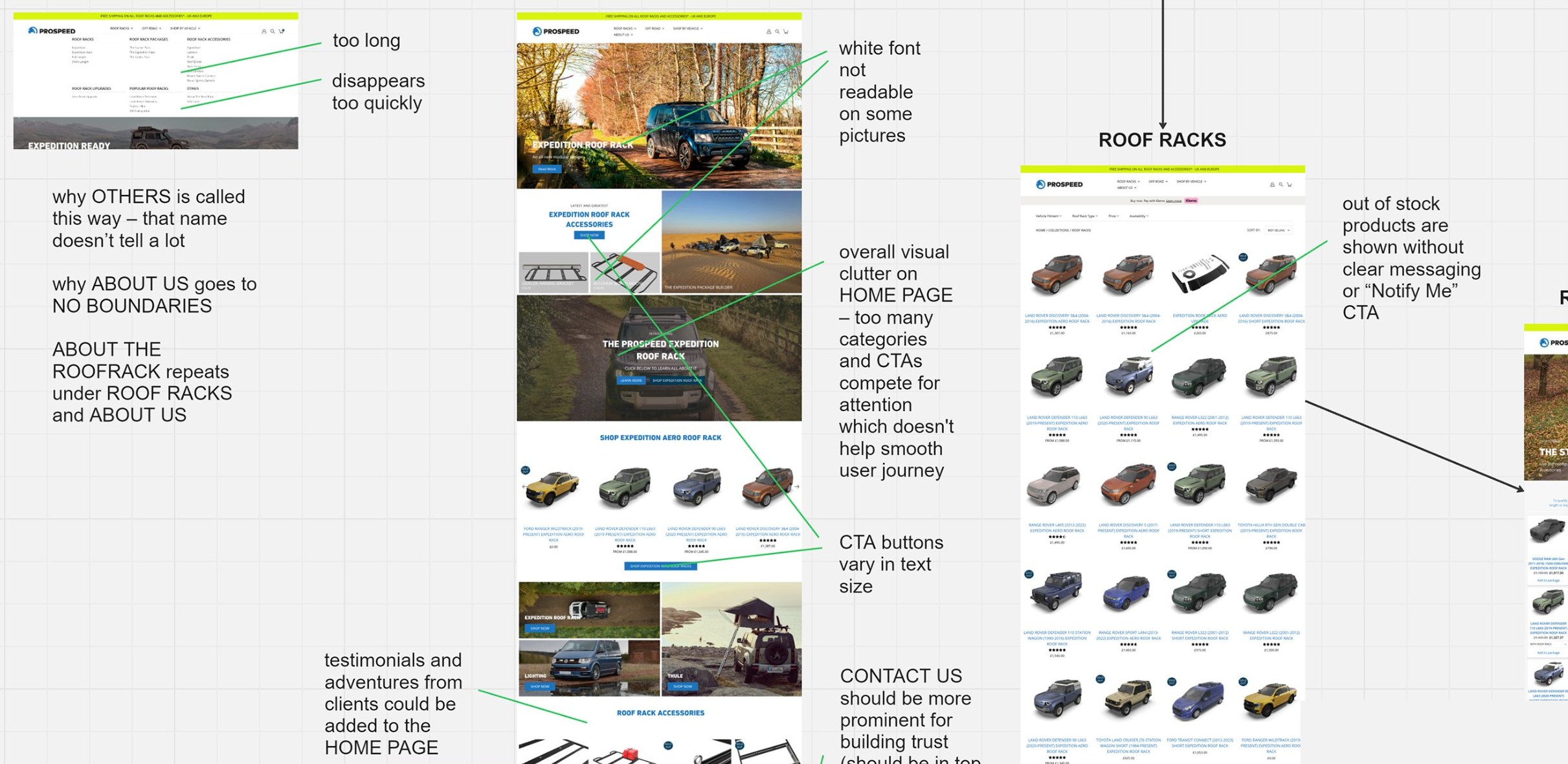
UX audit board of the previous Prospeed website, with annotated home page, navigation menu and roof racks listing
Previous website · Annotated audit of the home page, menu and roof rack listings
01
Confusing navigationAn overlong menu that vanished too quickly, vague labels like “Others”, and content repeated across sections.
02
A cluttered home pageToo many categories and calls to action competing for attention, breaking the user journey.
03
Readability and consistencyWhite text lost on busy photos, and buttons that varied in size from section to section.
04
Missed trust signalsOut-of-stock products with no clear message or “Notify me” option, contact details buried, and no customer stories on the home page.
04 — Approach

Audit, design, systemise

Regular workshops with developers, marketing and stakeholders kept every decision grounded in user needs, business goals and what could be built.

01

Discover

A UX audit of the existing site surfaced the usability and navigation pain points that set the priorities for the new information architecture.

02

Design

User flows, wireframes and high-fidelity prototypes in Figma, refined with the team before a line of code was written.

03

Systemise

A reusable design system — components, type, colour and layout rules — for consistency, smoother handoff and room to scale.
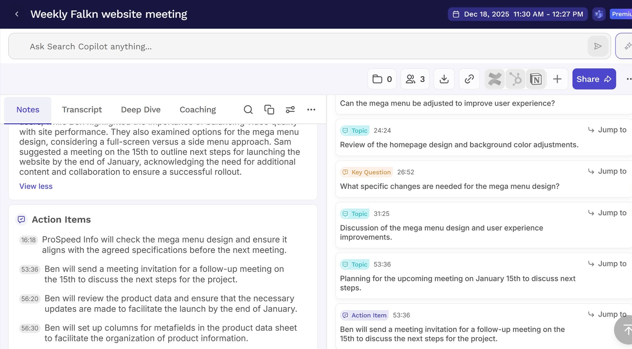
Notes from a weekly FALKN website meeting: mega menu design, homepage colour review, launch planning and action items for the team

Working with the team

Weekly website meetings with three developers, the Head of Marketing and stakeholders over nine months.

Every session tracked decisions, open questions and action items — from the mega menu to launch planning.

Key product decisions

ProblemWhat I designed
Large, technical catalogueClearer navigation, structured filtering and comparison layouts
Complex vehicle compatibilityA Vehicle Finder at the top of every page
Premium positioningTechnical specs paired with lifestyle photography, reviews and brand story
Shopping on mobileResponsive, mobile-first layouts
ConsistencyA reusable Figma design system shared with developers
05 — What I delivered

Brand, product and system

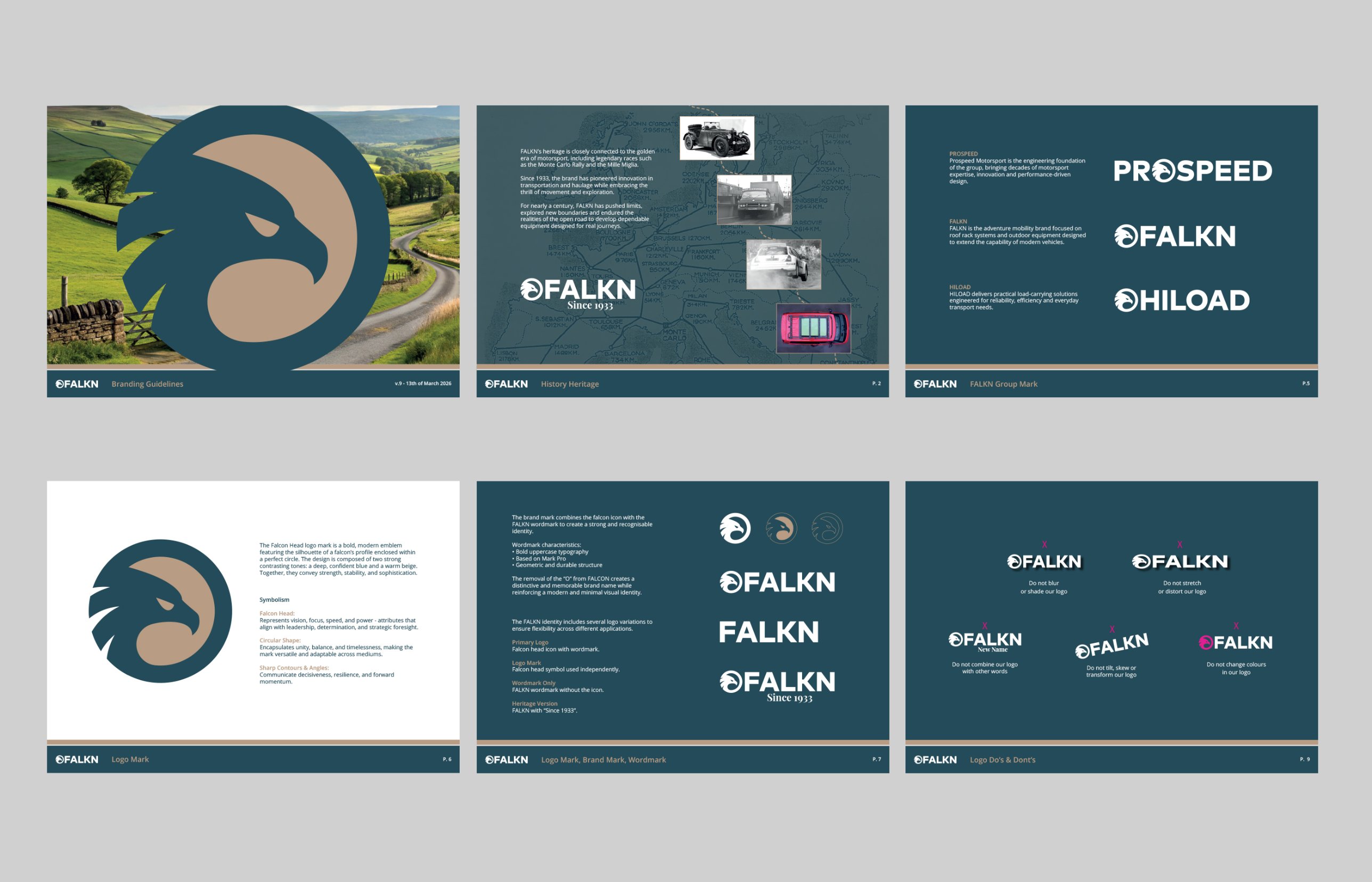
FALKN brand guidelines spreads: falcon head mark, heritage since 1933, group marks for Prospeed, FALKN and HILOAD, logo variations and misuse rules
Brand guidelinesFalcon head mark, group architecture, logo system and usage rules
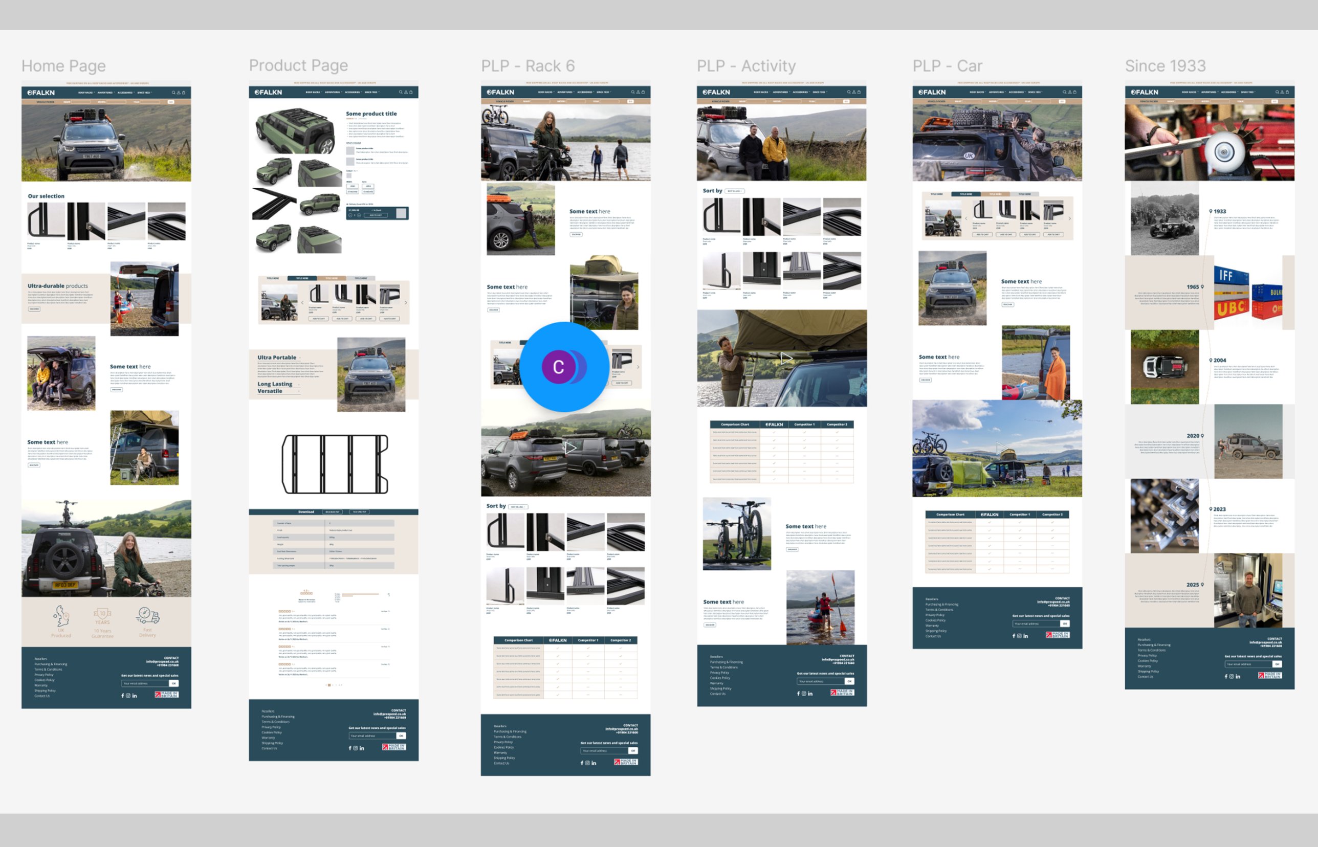
FALKN desktop page designs: home, product page, product listing pages by rack, activity and car, and Since 1933 heritage timeline
Desktop e-commerceHome, product page, listings by rack, activity and car, Since 1933
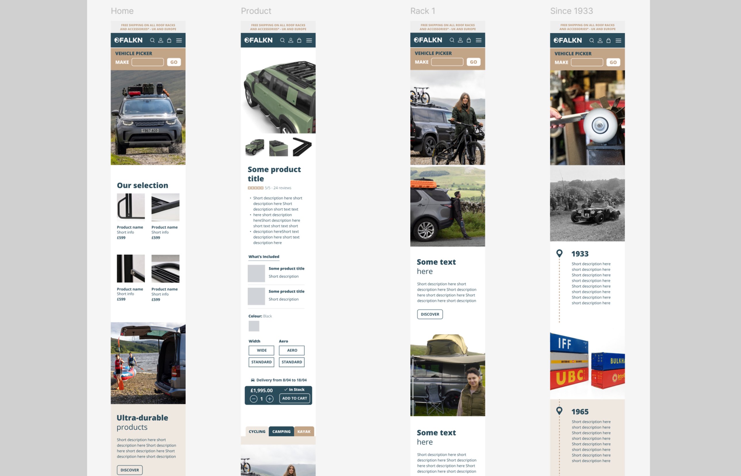
FALKN mobile page designs: home, product page with configurator and add to cart, rack listing and heritage timeline
MobileVehicle picker, product configurator and sticky add-to-cart
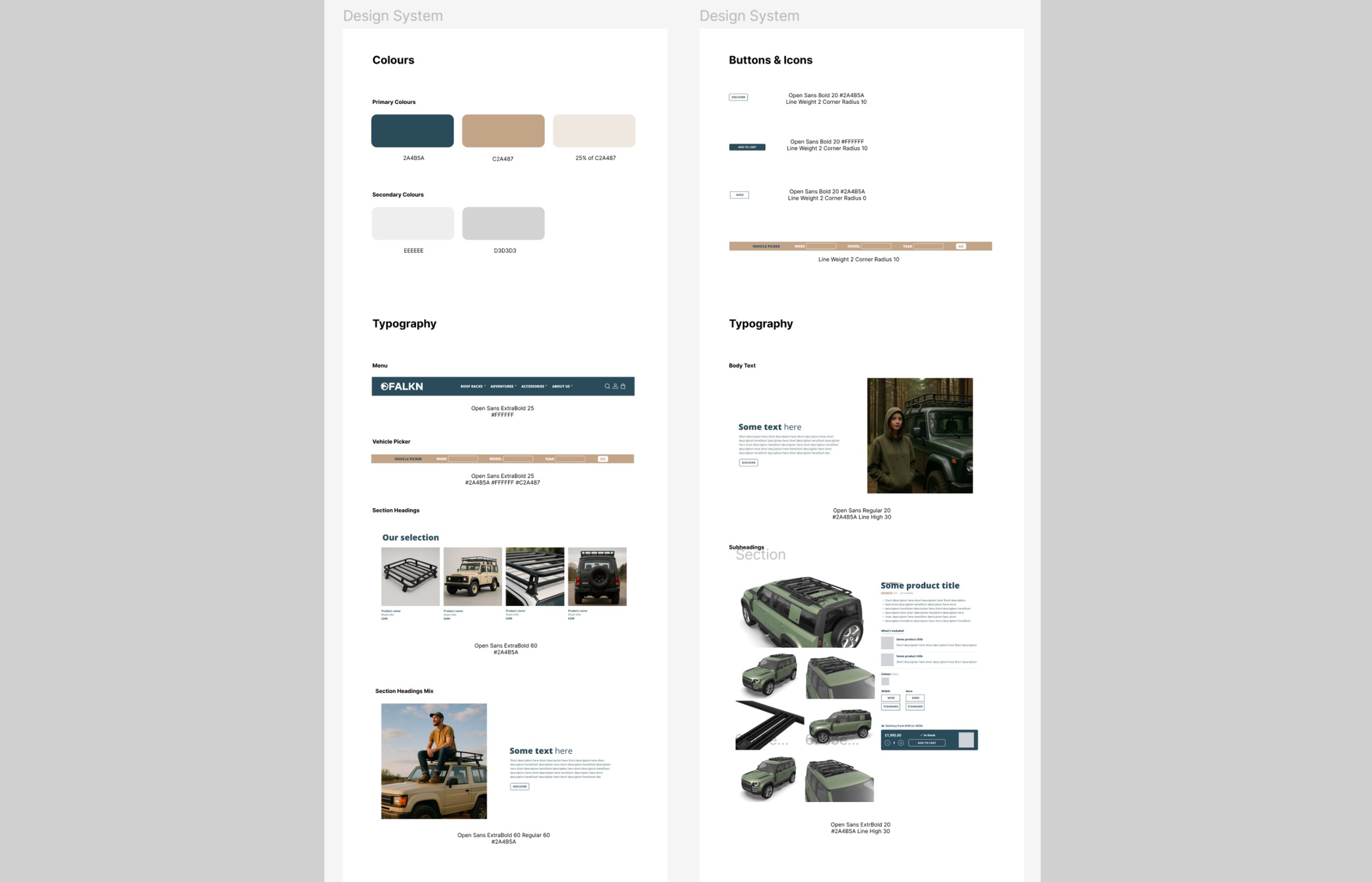
FALKN design system: primary and secondary colours, button and vehicle picker specs, and typography for menu, headings, body text and product pages
Design system for developersColours, typography, buttons and the vehicle picker — each with exact specs for handoff
06 — Outcome

What changed

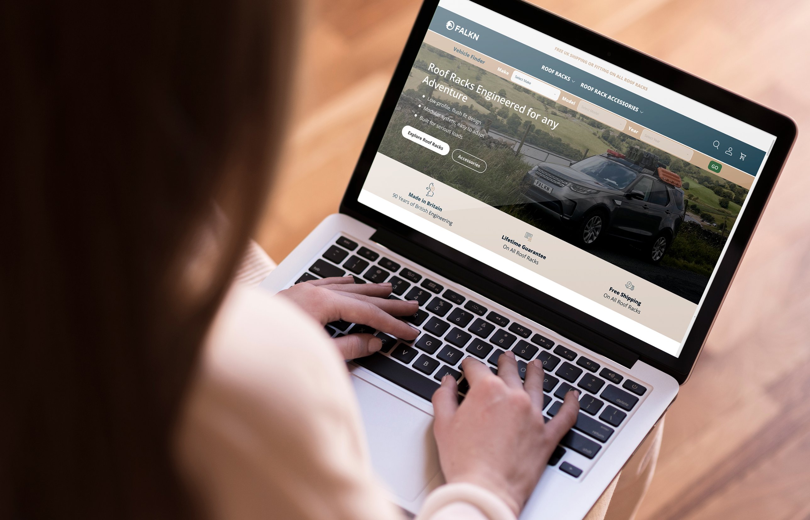
The launched FALKN website on a laptop, showing the vehicle finder, hero and trust badges
The launched website · Vehicle finder up front, trust badges straight after
Clearer information architecture
Products that are easier to find
One consistent experience on desktop and mobile
A design system built to scale, aligned with the brand
A clearer user journey from browsing to checkout
Less drop-off at the cart

“I’ve had the pleasure of working with Zu for around ten years. She is a great designer, adept at both graphic and web/app front-end design.

If you have any design requirements, from post-rationalising brand concepts into design files, creating brand guidelines, brand mock-ups, brochures, flyers, website wireframes, anything you can think of, I would recommend Zu for it.”

Samuel Butterworth · Global Head of Marketing
Next project One Team Tech
YouSpark Digital · Leeds, United Kingdom zu@youspark.digital