 YouSpark Digital
All work
YouSpark Digital
All work
Case study · UX research & mobile app
Stop Hate UK
Redesigning a hate crime reporting app so victims and witnesses can report safely, quickly and anonymously.
UX research
Product design
High-fidelity prototype
Developer handoff
- Client
- Stop Hate UK
- Role
- Lead product designer
- Timescale
- 2 months
- Team
- Me, 4 developers, product manager
- Platforms
- iOS & Android
- Tools
- Figma
01 — Overview
Reporting should never feel like a barrier
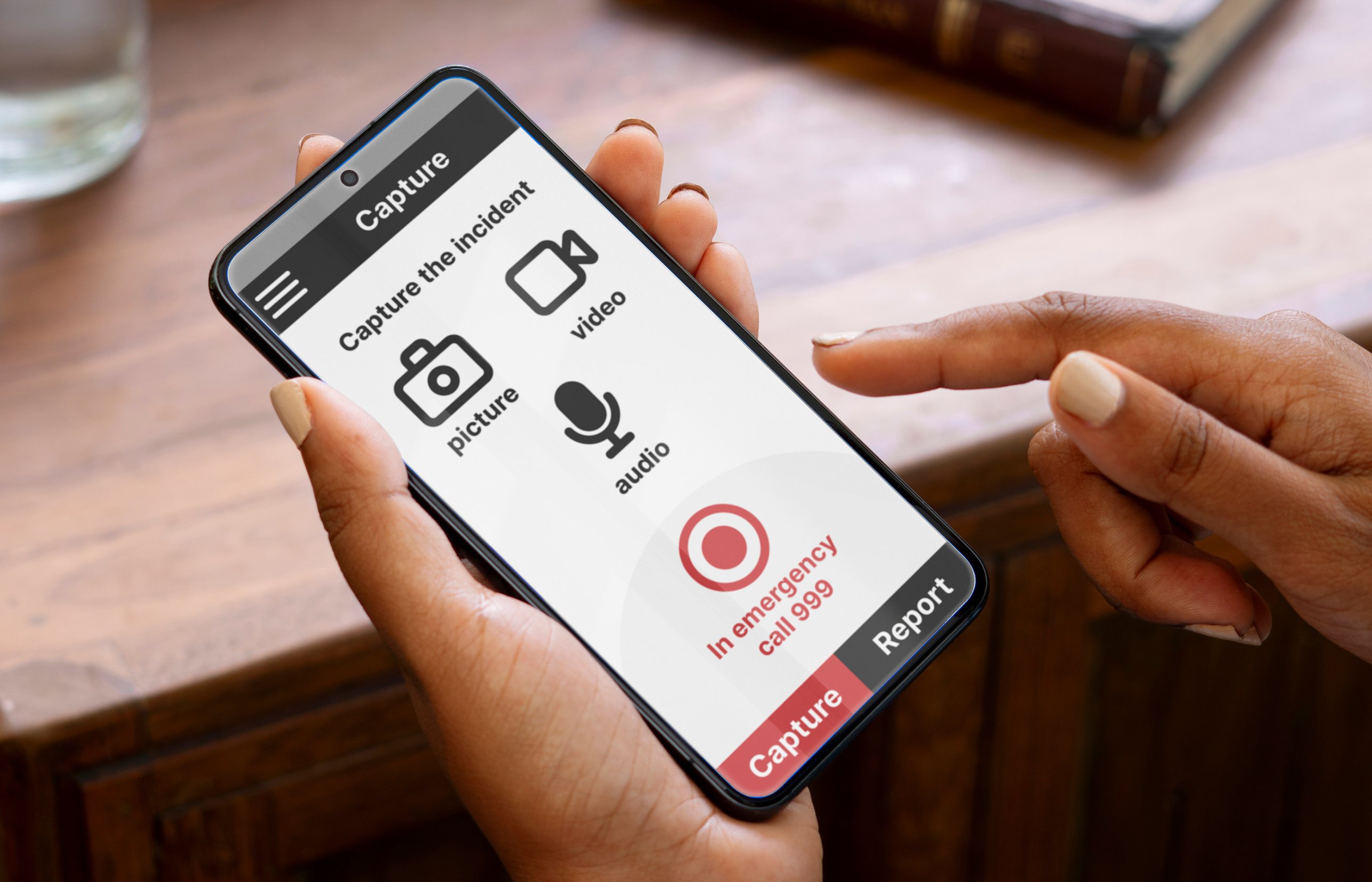
Stop Hate UK’s app lets victims and witnesses report hate crime. The old version had long forms, confusing navigation, weak accessibility and unclear feedback.
I led the user-centred redesign — balancing confidentiality, ease of use and inclusivity — working closely with stakeholders and developers.
02 — The challenge
People report hate crime under stress. The old app made a hard moment harder.
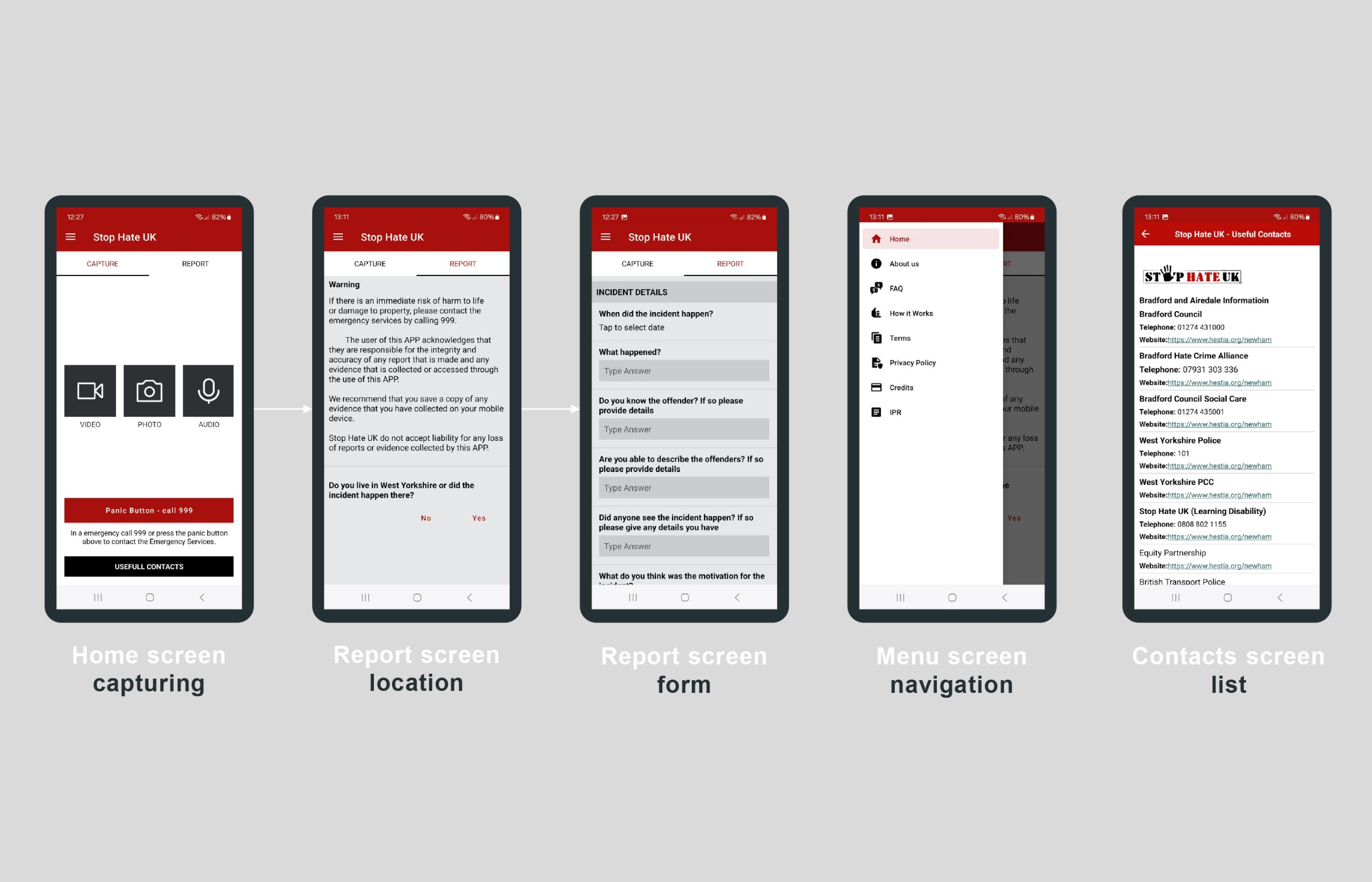
01Text-heavy screens that overwhelmed users
02Long, mandatory forms that led people to give up
03Unreliable location capture
04Too little accessibility support — text size, input help
Constraints
WCAG 2.1 AA
iOS and Android
Advocacy reporting requirements
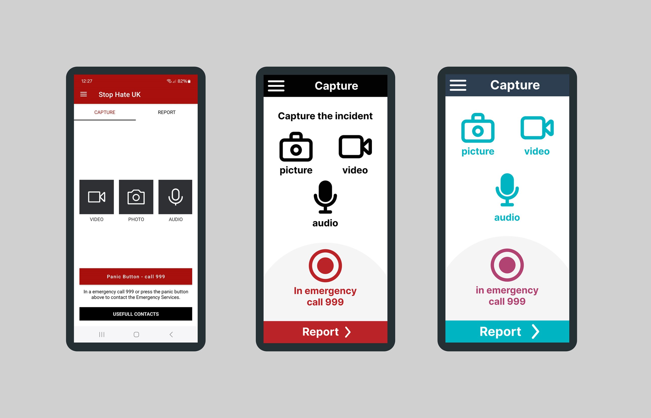
Keep familiar “Capture” and “Report” navigation
03 — Research
Testing with the people who need it most
Usability tests of the existing app with teenagers, LGBTQ+ advocates, older users and people with disabilities.
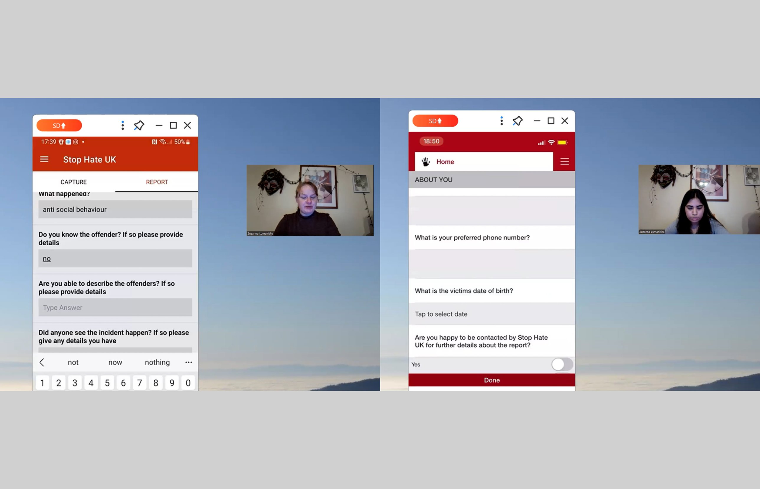
Personas
ZainabA student facing racial bullying, afraid of retaliation if she reports.
RuthAn older woman with low confidence using technology.
04 — Process
Clarity, accessibility, reassurance
An anonymous, accessible flow that lowers barriers and gives advocacy services better-quality reports.
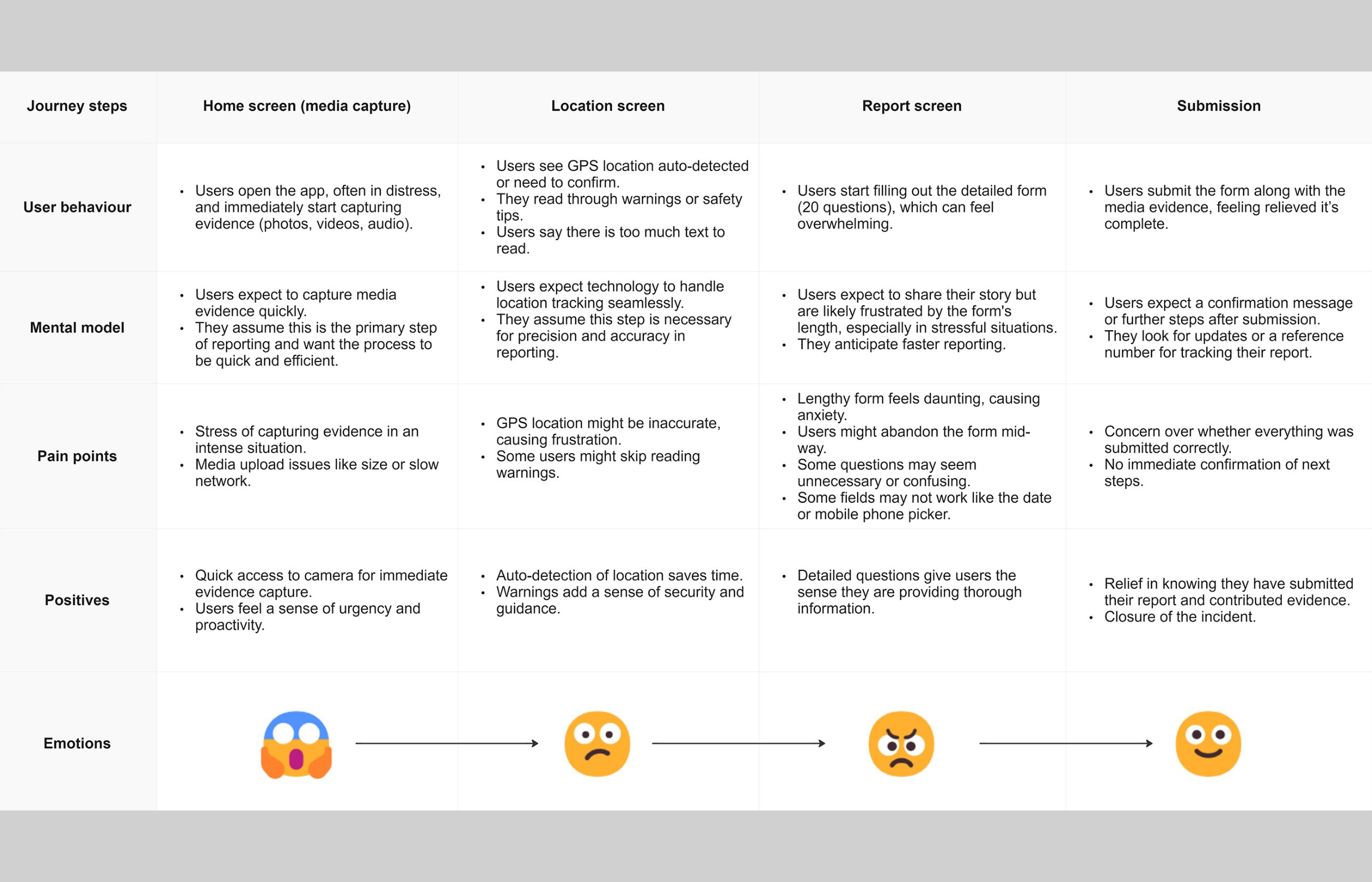
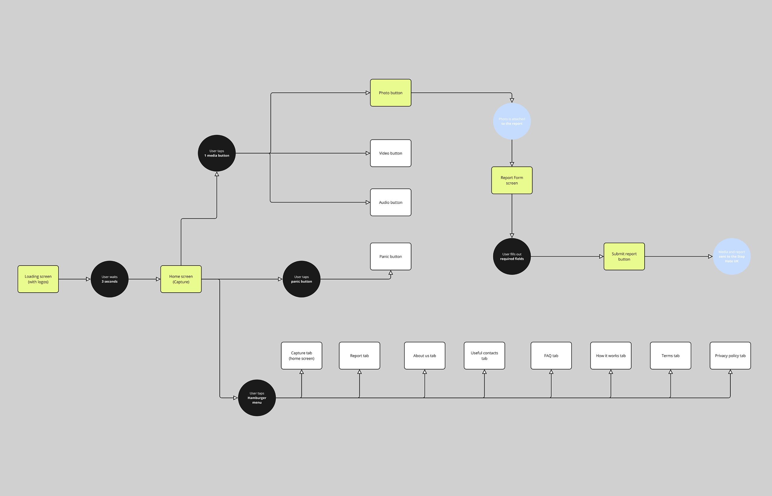
01Test and understandUsability tests on the old app, turned into personas
02Map the journeysCurrent and ideal flows for victims, witnesses and authorities
03Wireframe and prototypeAlternative layouts sketched, then high-fidelity prototypes in Figma
04Test againUsability sessions, A/B tests and user comments fed each iteration
05Build with the teamPrioritisation workshops, and dynamic vs static screens agreed with developers
05 — Key design decisions
Fewer steps, more reassurance
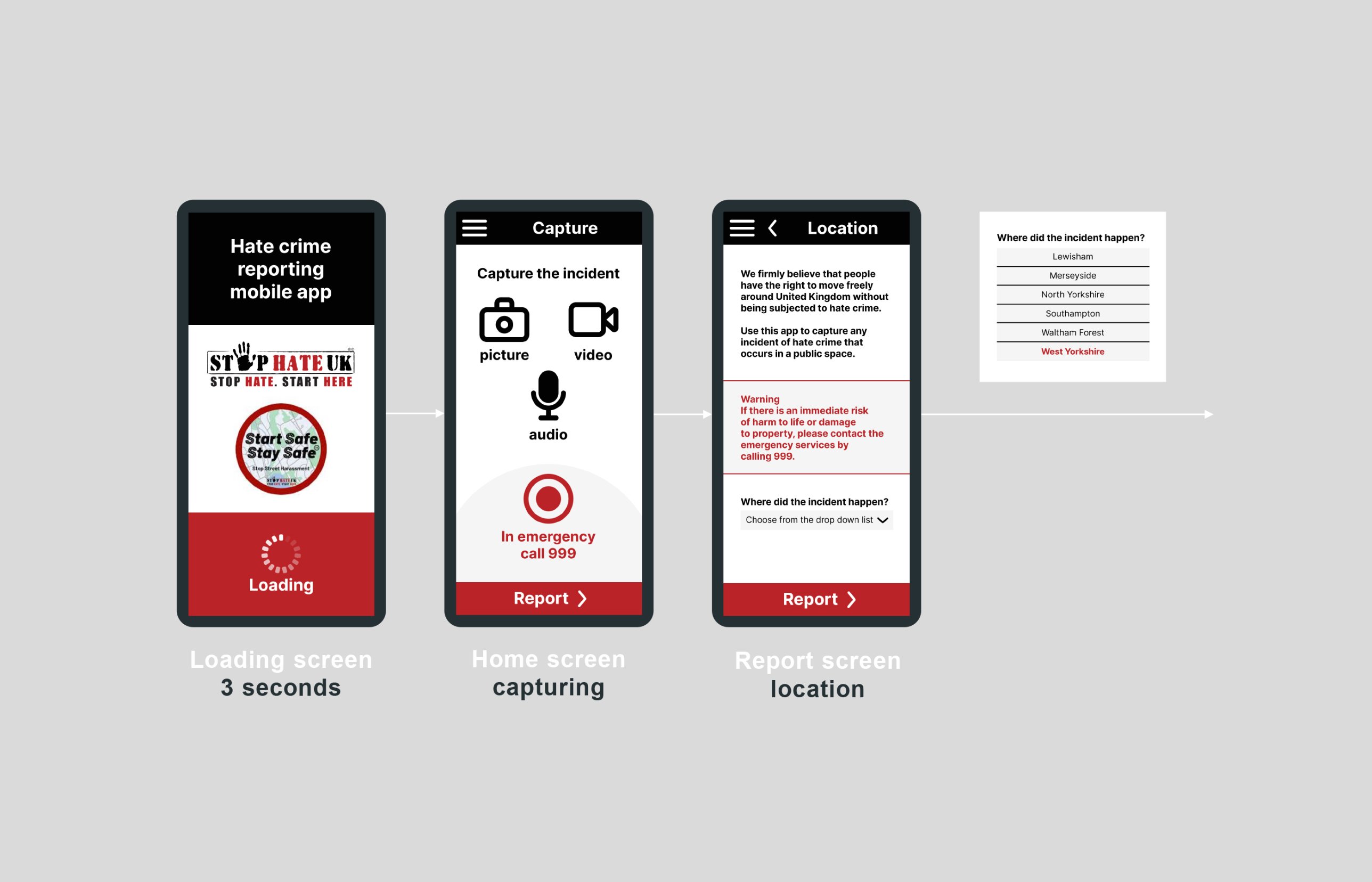
Panic buttonOne tap to emergency help
Quick capturePhoto, video and audio with GPS tagging
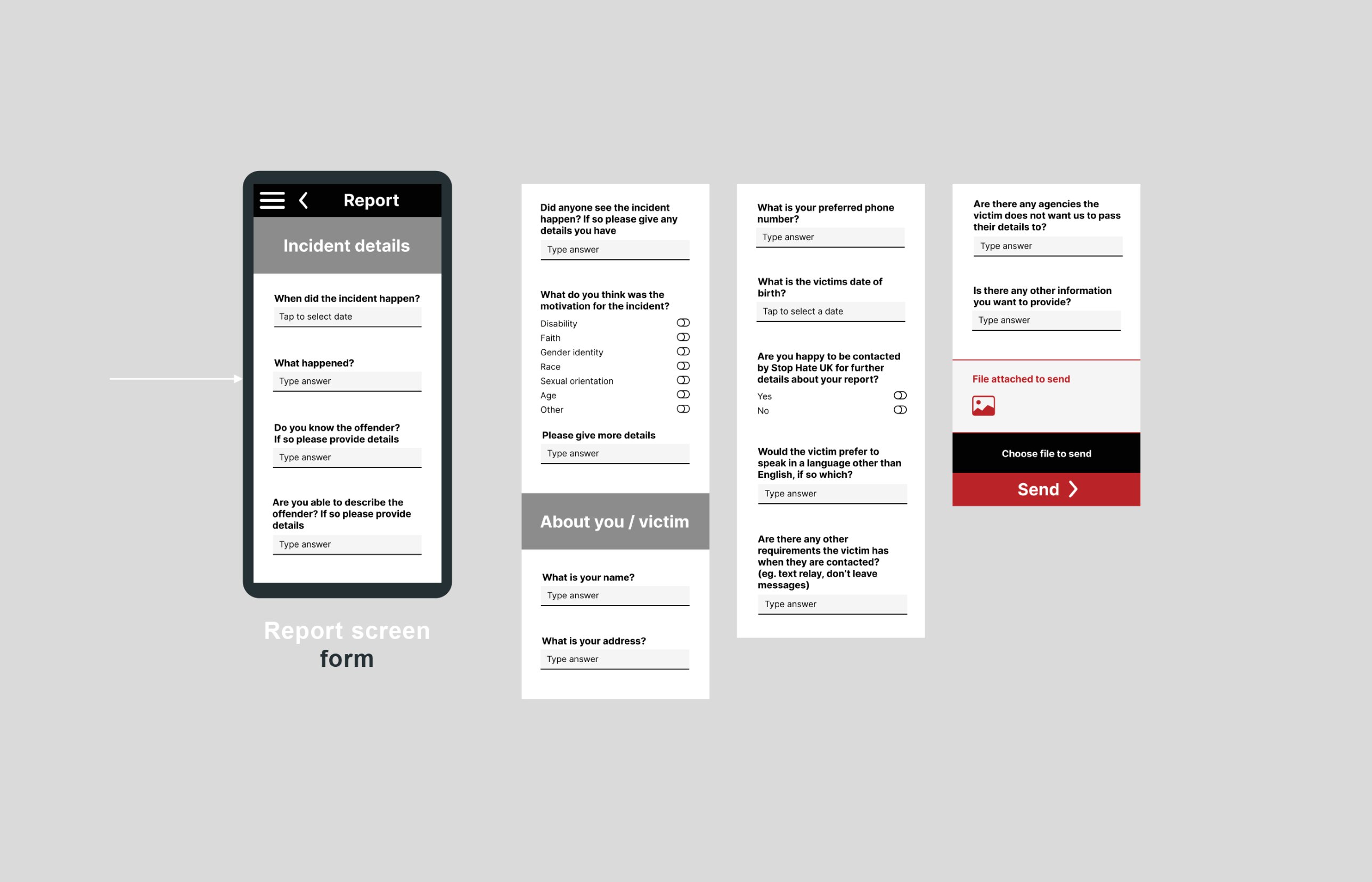
Shorter formsPlus “I don’t know” for unclear fields
Progress and error cuesAlways know where you are
Less textConcise guidance and visual cues
Easier inputsClearer date pickers and address fields
Readable by allLarger text and stronger contrast
AnonymityAnonymous options and clear confirmation screens
06 — The new app
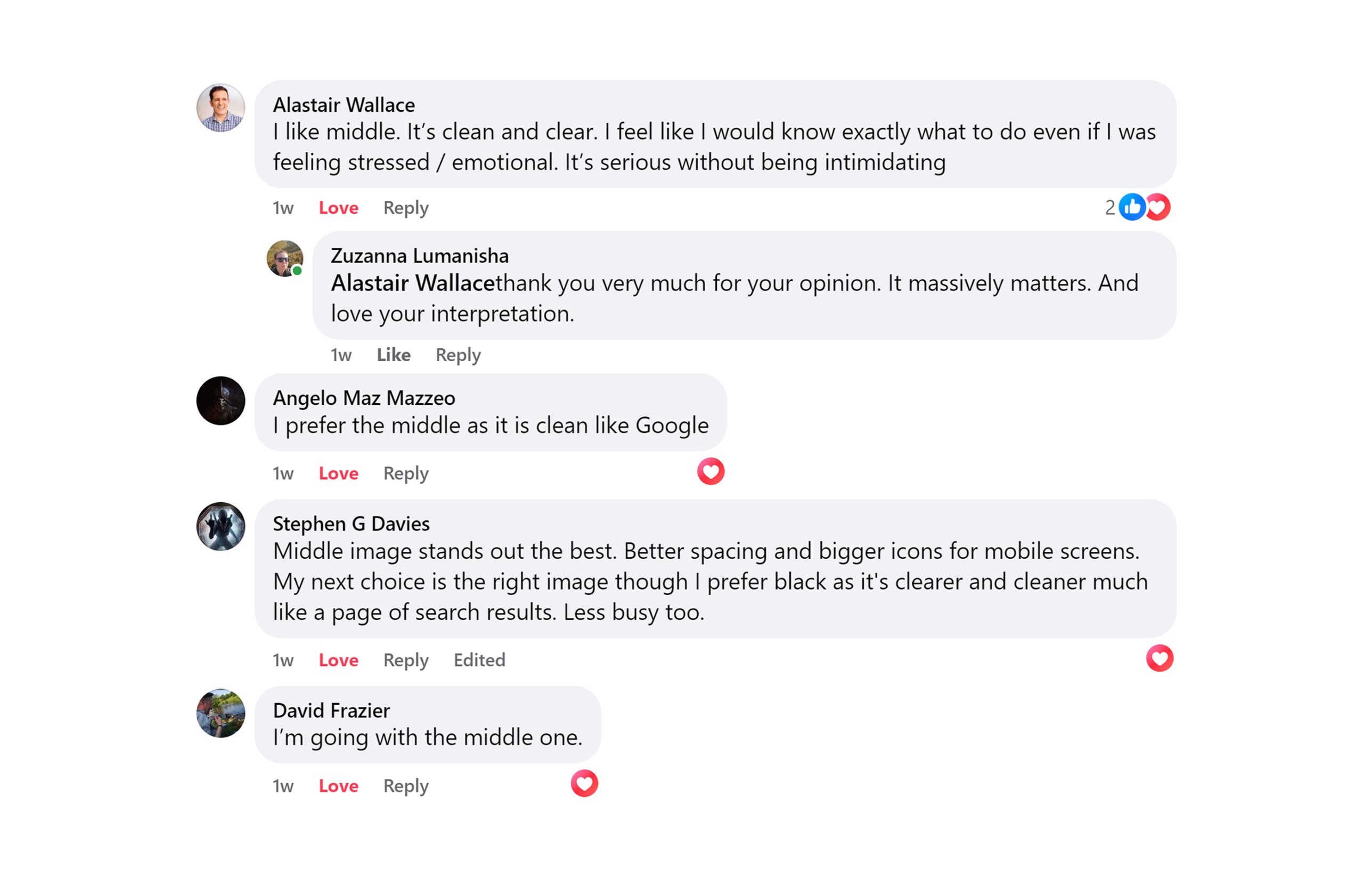
Tested, refined, shipped
07 — Outcome
80%
of users now complete a report in under 3 minutes — down from around 8.
More accessibleWCAG-compliant flows that older and less tech-confident users found easier
Safer-feelingAnonymity, progress and confirmation screens reassured users
Stakeholder buy-inA design that balances advocacy needs with users’ realities
Live on both storesAvailable on the App Store and Google Play, with post-launch refinements ongoing
What’s next
Multilingual support
Real-time case tracking
BSL video reporting
Audio guidance
Next project
Hoteligo
YouSpark Digital · Leeds, United Kingdom
zu@youspark.digital